Psoralen Non equilibrium Aggregate
\(D_{ap}\) Analysis
01_28_19
library(tidyverse)
library(cowplot)
library(broom)
library(modelr)
library(viridis)
library(lubridate)
library(hms)
library(knitr)
library(kableExtra)

knitr::opts_chunk$set(tidy.opts=list(width.cutoff=60),tidy=TRUE, echo = TRUE, message=FALSE, warning=FALSE, fig.align="center")

source("../../tools/echem_processing_tools.R")
source("../../tools/plotting_tools.R")

theme_set(theme_1())
Intro
Now that three replicates of the nonequilibrium psoralen experiment have been completed, let’s combine the datasets to get a feel for what the experiments can broadly tell us. There were two goals with this set of experiments:
- Test whether psoralen (trioxsalen) treatment has an effect on measured \(D_{ap}\) on the IDA biofilms.
- Acquire a set of controls that would allow us to confidently estimate \(D_{ap}\) for a normal biofilm.
I will also compare the biofilm datasets to a ‘blank’ dataset to give us some perspective.
Results
I’m using processed datasets from the three psoralen nonequil experiments (01/08/19, 01/17/19, and 01/23/19), as well as the blank dataset from (11/28/18).
Please look back at those notebooks/datasets for more info about the raw data and acquisition parameters. I believe the acquisition parameters for all 4 datasets are nearly identical, except the scan window (voltage range) was changed a little, and accordingly the GC collector potential may be 0V instead of +0.1V for exeriments 3 and 4.
Data import
First let’s import the datasets and exclude some of the problematic points that were obvious from the past analyses.
df_blank <- read_csv("../../11_28_18_blank_IDA/Processing/11_28_18_swv_gc_soak_processed.csv") %>%
  select(reactor,electrode_from_swv,signal_from_swv,electrode_from_gc, signal_from_gc,echem_from_swv ) %>%
  mutate(run = 1, rep = 0, treatment='blank', exp_id = 'blank')


df_3 <- read_csv("../../01_23_19_psoralen_nonequil_3/Processing/01_23_19_processed_swv_gc_all.csv") %>%
  select(treatment,run,rep,reactor,electrode_from_swv,signal_from_swv,electrode_from_gc, signal_from_gc, echem_from_swv ) %>%
  mutate(exp_id = '3') %>%
  filter(run!=1 | treatment!='psoralen' | rep<14 ) %>%
  filter(run!=4 | treatment!='control' | rep>1 )


df_2_control <- read_csv("../../01_17_19_psoralen_nonequil_2/Processing/01_17_19_swv_gc_control_dap_processed.csv")
df_2_psoralen <- read_csv("../../01_17_19_psoralen_nonequil_2/Processing/01_17_19_swv_gc_psoralen_dap_processed.csv")

df_2 <- rbind(df_2_control,df_2_psoralen) %>%
  select(treatment,run, rep, reactor,electrode_from_swv,signal_from_swv,electrode_from_gc, signal_from_gc, echem_from_swv ) %>%
  mutate(exp_id = '2')

df_1 <- read_csv("../../01_08_19_psoralen_nonequil/Processing/01_08_19_processed_swv_gc_signals.csv") %>%
  select(treatment,run, rep, reactor,electrode_from_swv,signal_from_swv,electrode_from_gc, signal_from_gc , echem_from_swv) %>%
  mutate(exp_id = "1")


df_all <- rbind(df_1,df_2,df_3,df_blank)
Examine Linear Fits
First, let’s look at the blank dataset.
ggplot(df_all %>% filter(electrode_from_swv=='i1' & electrode_from_gc=='i2' & treatment=='blank'),
       aes(x = signal_from_swv, y = signal_from_gc)) +
  geom_point() +
  geom_smooth(method='lm')+
  facet_wrap(~exp_id)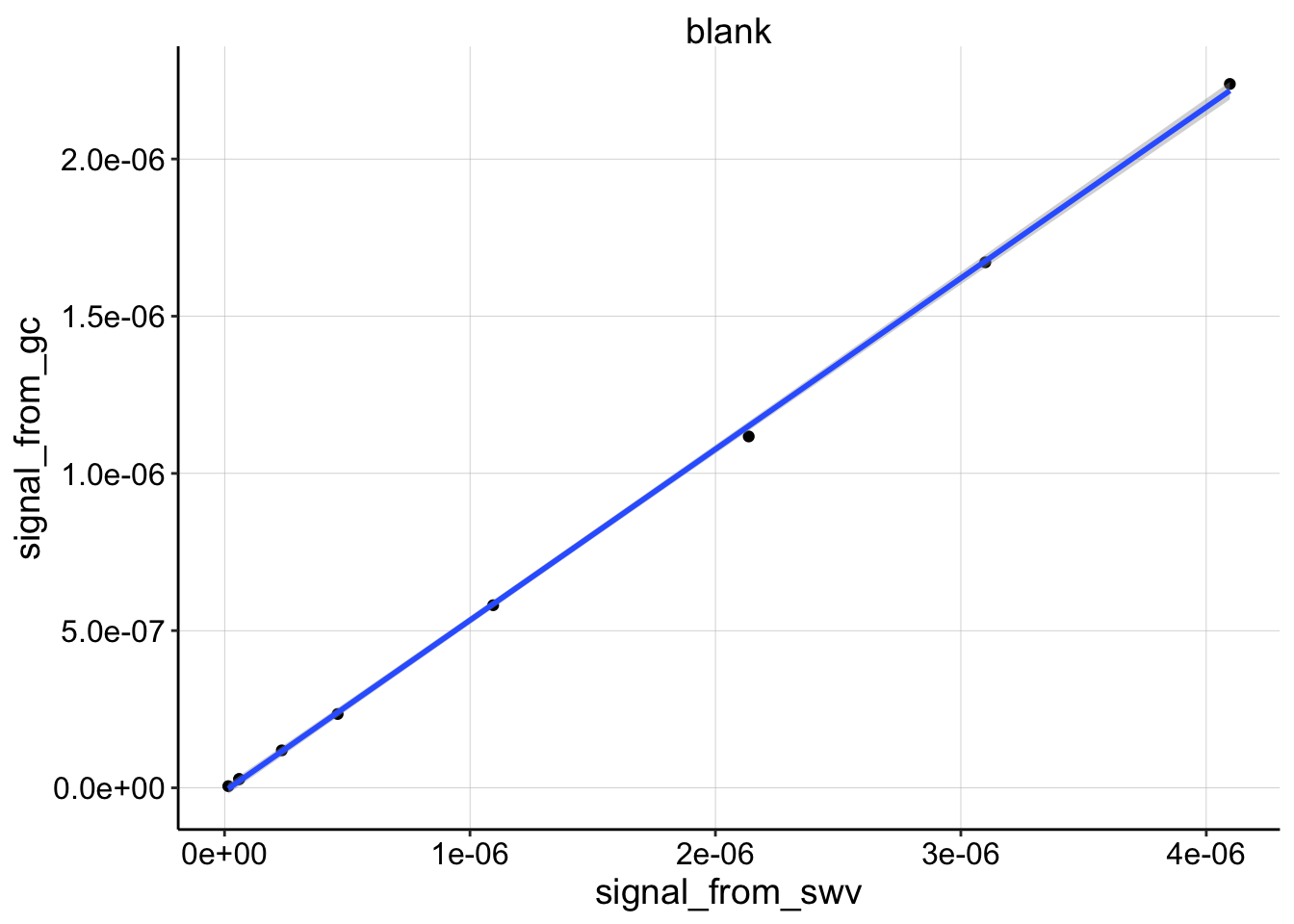
You can see that the blank dataset is almost perfectly linear.
Now let’s look at all of the biofilm data. Below the data are broken down by experiment number and treatment. The colors represent each run within each experiment. The scales are free, so you can assess how well each dataset is fit by the linear model. Remember we are very interested to know whether the shape is linear or nonlinear.
ggplot(df_all %>% filter(electrode_from_swv=='i1' & electrode_from_gc=='i2' & treatment!='blank'),
       aes(x = signal_from_swv, y = signal_from_gc, color = factor(run))) +
  geom_point() +
  geom_smooth(method='lm')+
  facet_wrap(treatment~exp_id,scales='free')+
  scale_color_viridis(discrete = T)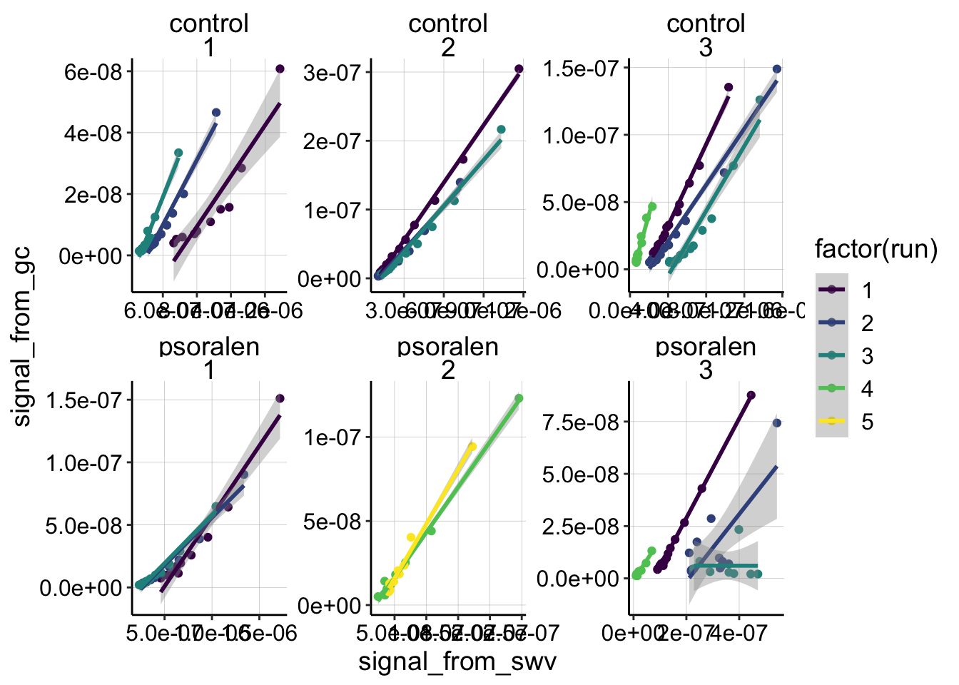
# ggplot(df_all %>%
#          filter(electrode_from_swv=='i1' & electrode_from_gc=='i2') %>%
#          filter(exp_id=='3' & run==4),
#        aes(x = signal_from_swv, y = signal_from_gc, color = factor(run), shape = treatment)) +
#   geom_point() +
#   geom_smooth(method='lm') +
#   facet_wrap(reactor~exp_id,scales='free')
Overall, I think the data are fit pretty well by the linear models. There are definitely subsets that are not fit well, and we can break those into two categories: obviously bad data, and good data that doesn’t look linear. For experiment 3 psoralen treated biofilm, you can see that runs 2 and 3 do not look like nice monotonic trends. This is likely because the SWV scans were super weird for those runs - therefore we will ignore them later on. On the other hand, exp 1 run 1 for control and psoralen looks pretty clean, but they look quite nonlinear. There are several other runs in the dataset that look somewhat nonlinear, and it is interesting to think about what that might mean. For now though, let’s move forward with the assumption that most of the datasets can be reasonably fit with a linear model.
Given that we can fit with a linear model let’s now compare the slopes of the datasets, by looking at the same plot with fixed scales:
ggplot(df_all %>% filter(electrode_from_swv=='i1' & electrode_from_gc=='i2' & treatment!='blank'),
aes(x = signal_from_swv, y = signal_from_gc, color = factor(run))) +
geom_point() +
geom_smooth(method='lm')+
facet_grid(treatment~exp_id)+
scale_color_viridis(discrete = T)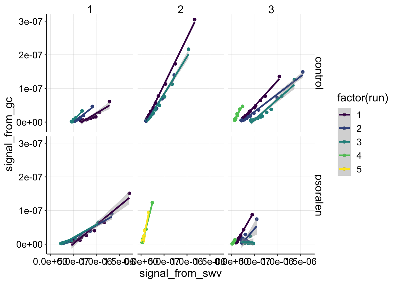 We can see some clear differences in slopes across the datasets. However, keep in mind that exp 2 psoralen and experiment 3 run 4 both conditions were taken with SWVslow settings that will increase the slope due to the different scan rate. Still, it’s clear that there’s a variety of slopes, but also that none of the slopes seem like crazy outliers.
\(D_{ap}\) Estimation
Now, let’s grab the coefficients of those linear fits and calculate \(D_{ap}\) estimates using our known parameters.
Recall: \[ D_{ap} = \frac{(m A \psi)^2 }{S^2 \pi t_p }\]
Here’s our default \(D_{ap}\) calculator function to get from slope, \(m\), to our estimate.
dap_calc <- function(m, t_p=1/(2*300)){

  psi <-  0.91
  A <-  0.013 #cm^2
  S <-  18.4 #cm
  d_ap <- (m*A*psi)^2 / (S^2 * pi * t_p)

  d_ap
}
Now, we’ll fit all the subsets of data and grab metrics like \(R^2\) and confidence intervals for the slope coefficient. Let’s go ahead and plot all of the \(R^2\) values for the datasets to quantitatively assess the fits.
swv_gc_all <- df_all %>%
filter(electrode_from_swv=='i1' & electrode_from_gc=='i2' ) %>%
group_by(treatment,exp_id,run,echem_from_swv) %>%
do(fit = lm(signal_from_gc~signal_from_swv,data = .))
swv_gc_fit_tidy <- tidy(swv_gc_all,fit,conf.int=T)
swv_gc_fit_glance <- glance(swv_gc_all,fit) %>%
select(treatment,exp_id,run,r.squared,adj.r.squared)
swv_gc_fit <- left_join(swv_gc_fit_tidy %>% filter(term=='signal_from_swv'), swv_gc_fit_glance, by = c('treatment','exp_id','run','echem_from_swv'))
ggplot(swv_gc_fit, aes(x = exp_id, y = r.squared, shape=treatment,color = factor(run)))+
geom_point()+
scale_color_viridis(discrete = T)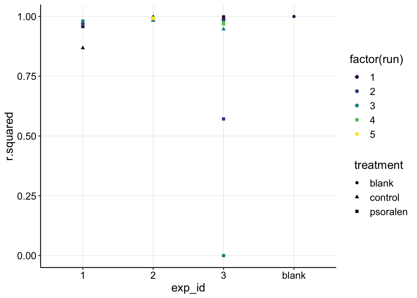 You can see that all of the datasets have very high \(R^2\) values (1 is a perfect line), except for the problematic subsets we identified earlier (exp 3, psoralen, runs 2-3), and a very nonlinear subset (exp 1 control run 1)
Let’s move forward calculating \(D_{ap}\), but we’ll exclude all the models with \(R^2 < 0.9\). First calculate \(D_{ap}\) for all the data that was acquired with SWV fast settings, which has a pulse time of \(t_p=1/600\)
swv_gc_dap <- swv_gc_fit %>%
  filter(r.squared>0.9) %>%
  filter(echem_from_swv=='SWV' | echem_from_swv == 'SWV.txt') %>%
  mutate(dap=dap_calc(m = estimate)) %>%
  mutate(dap_high = dap_calc(m = conf.high)) %>%
  mutate(dap_low = dap_calc(m = conf.low))


swv_gc_dap %>%
  select(treatment, exp_id, run, echem_from_swv, estimate, conf.low, conf.high, r.squared, dap, dap_high, dap_low) %>%
  kable() %>%
kable_styling(bootstrap_options = c("striped", "hover", "condensed", "responsive"), full_width = F)| treatment | exp_id | run | echem_from_swv | estimate | conf.low | conf.high | r.squared | dap | dap_high | dap_low |
|---|---|---|---|---|---|---|---|---|---|---|
| blank | blank | 1 | SWV.txt | 0.5440039 | 0.5351986 | 0.5528091 | 0.9996721 | 2.34e-05 | 2.41e-05 | 2.26e-05 |
| control | 1 | 2 | SWV | 0.1057311 | 0.0954872 | 0.1159749 | 0.9745201 | 9.00e-07 | 1.10e-06 | 7.00e-07 |
| control | 1 | 3 | SWV | 0.1395321 | 0.1230390 | 0.1560252 | 0.9625405 | 1.50e-06 | 1.90e-06 | 1.20e-06 |
| control | 2 | 1 | SWV | 0.2791415 | 0.2711777 | 0.2871052 | 0.9977380 | 6.20e-06 | 6.50e-06 | 5.80e-06 |
| control | 2 | 2 | SWV | 0.2125194 | 0.1958284 | 0.2292104 | 0.9831090 | 3.60e-06 | 4.10e-06 | 3.00e-06 |
| control | 2 | 3 | SWV | 0.2230086 | 0.2063346 | 0.2396825 | 0.9846676 | 3.90e-06 | 4.50e-06 | 3.40e-06 |
| control | 3 | 1 | SWV | 0.1513328 | 0.1427183 | 0.1599473 | 0.9910550 | 1.80e-06 | 2.00e-06 | 1.60e-06 |
| control | 3 | 2 | SWV | 0.1045085 | 0.0969763 | 0.1120407 | 0.9857378 | 9.00e-07 | 1.00e-06 | 7.00e-07 |
| control | 3 | 3 | SWV | 0.1203080 | 0.1032345 | 0.1373816 | 0.9468821 | 1.10e-06 | 1.50e-06 | 8.00e-07 |
| psoralen | 1 | 1 | SWV | 0.1123415 | 0.0930391 | 0.1316439 | 0.9574755 | 1.00e-06 | 1.40e-06 | 7.00e-07 |
| psoralen | 1 | 2 | SWV | 0.0759908 | 0.0671467 | 0.0848349 | 0.9636430 | 5.00e-07 | 6.00e-07 | 4.00e-07 |
| psoralen | 1 | 3 | SWV | 0.0771662 | 0.0713824 | 0.0829500 | 0.9803910 | 5.00e-07 | 5.00e-07 | 4.00e-07 |
| psoralen | 3 | 1 | SWV | 0.2378615 | 0.2307340 | 0.2449890 | 0.9979653 | 4.50e-06 | 4.70e-06 | 4.20e-06 |
And now we’ll separately calculate \(D_{ap}\) for the SWV slow subsets, with \(t_p = 1/30\).
swvSlow_gc_dap <- swv_gc_fit %>%
  filter(r.squared>0.9) %>%
  filter(echem_from_swv=='SWVslow') %>%
  mutate(dap=dap_calc(m = estimate,t_p= (1 / 30))) %>%
  mutate(dap_high = dap_calc(m = conf.high,t_p= (1 / 30))) %>%
  mutate(dap_low = dap_calc(m = conf.low,t_p= (1 / 30)))

swvSlow_gc_dap %>%
  select(treatment, exp_id, run, echem_from_swv, estimate, conf.low, conf.high, r.squared, dap, dap_high, dap_low) %>%
  kable() %>%
kable_styling(bootstrap_options = c("striped", "hover", "condensed", "responsive"),full_width = F)| treatment | exp_id | run | echem_from_swv | estimate | conf.low | conf.high | r.squared | dap | dap_high | dap_low |
|---|---|---|---|---|---|---|---|---|---|---|
| control | 3 | 4 | SWVslow | 0.2542759 | 0.2190894 | 0.2894625 | 0.9674197 | 3.0e-07 | 3.0e-07 | 2.0e-07 |
| psoralen | 2 | 4 | SWVslow | 0.5389501 | 0.5114693 | 0.5664309 | 0.9941310 | 1.1e-06 | 1.3e-06 | 1.0e-06 |
| psoralen | 2 | 5 | SWVslow | 0.6476912 | 0.6062765 | 0.6891059 | 0.9918318 | 1.7e-06 | 1.9e-06 | 1.5e-06 |
| psoralen | 3 | 4 | SWVslow | 0.1914529 | 0.1691961 | 0.2137096 | 0.9734997 | 1.0e-07 | 2.0e-07 | 1.0e-07 |
Evaluating \(D_{ap}\) Estimates
Now let’s combine all of the \(D_{ap}\) estimates and plot them. First, let’s look at our primary question, which was whether or not psoralen treatment affects \(D_{ap}\).
swv_gc_dap_estimates <- rbind(swv_gc_dap, swvSlow_gc_dap)
ggplot(swv_gc_dap_estimates %>% filter(treatment!='blank'),
aes(x = treatment, y = dap, color = factor(run), shape = treatment)) +
geom_point() +
geom_pointrange(aes(ymin = dap_low, ymax = dap_high))+
facet_wrap(~exp_id) +
scale_color_viridis(discrete = T)+
labs(y=expression(D[ap] (cm^2 / sec)),color='Run Number') 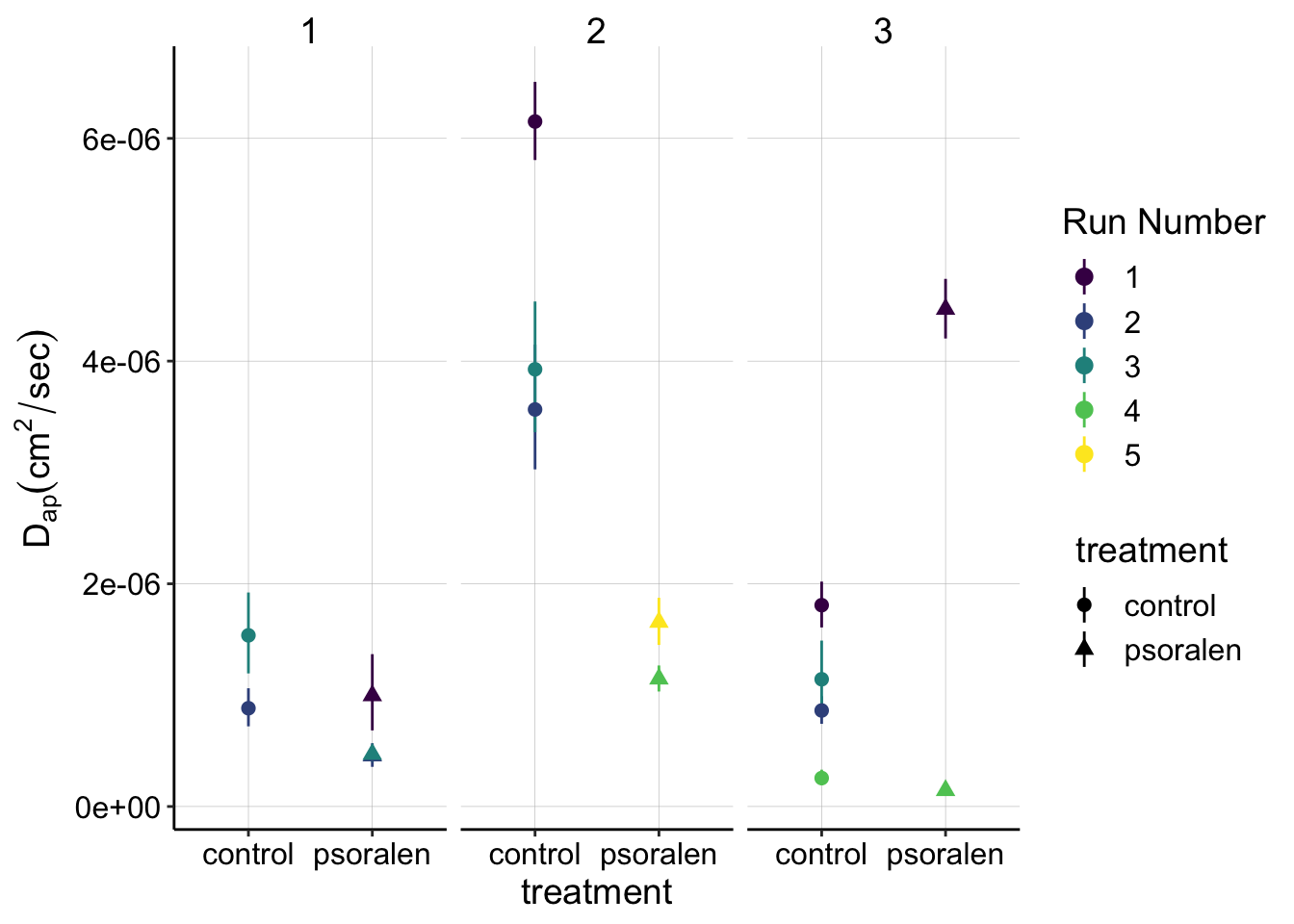 This plot may be a little much at first - feel free to look at the tabs below with only the subsets of SWVfast or SWVslow data, which may be more digestible.
Overall, despite individual experiments looking like psoralen treated biofilms may have lower \(D_{ap}\) estimates, there is significant overlap between the two treatments and no consistent trend that suggests there is a true, clear difference between control and psoralen treated biofilms.
- Experiment 1: The psoralen \(D_{ap}\) estimates clearly overlap with the control estimates, suggesting that the difference is not meaningful.
- Experiment 2: The control \(D_{ap}\) is much higher than the psoralen, but the psoralen datasets were taken with SWV slow parameters, which all (including control) have significantly lower values - therefore it may not be a fair comparison.
- Experiment 3: The SWV fast scans (runs 1-3) show that the psoralen biofilm actually has a higher value than the control. For the SWV slow scans (run 4), the control is slightly higher than the psoralen.
SWV fast Data
ggplot(swv_gc_dap %>% filter(treatment!='blank'),
       aes(x = treatment, y = dap, color = factor(run),shape = treatment)) +
  geom_point() +
  geom_pointrange(aes(ymin = dap_low, ymax = dap_high))+
  facet_wrap(~exp_id) +
labs(y=expression(D[ap] (cm^2 / sec)),color='Run Number',shape='Run Number') 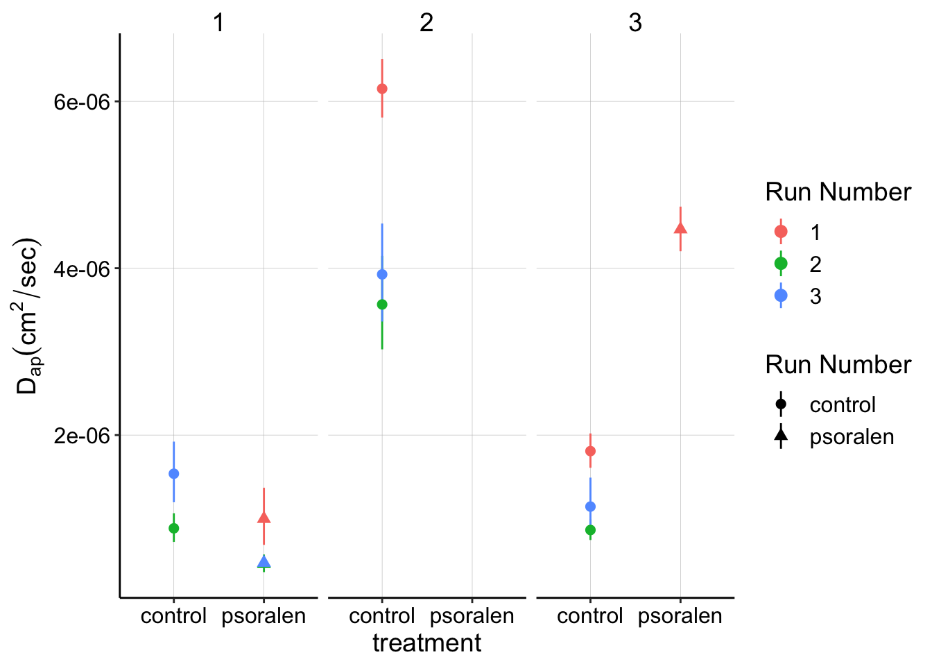
SWV slow data
ggplot(swvSlow_gc_dap %>% filter(treatment!='blank'),
       aes(x = treatment, y = dap, color = factor(run),shape = treatment)) +
  geom_point() +
  geom_pointrange(aes(ymin = dap_low, ymax = dap_high))+
  facet_wrap(~exp_id) +
labs(y=expression(D[ap] (cm^2 / sec)),color='Run Number') 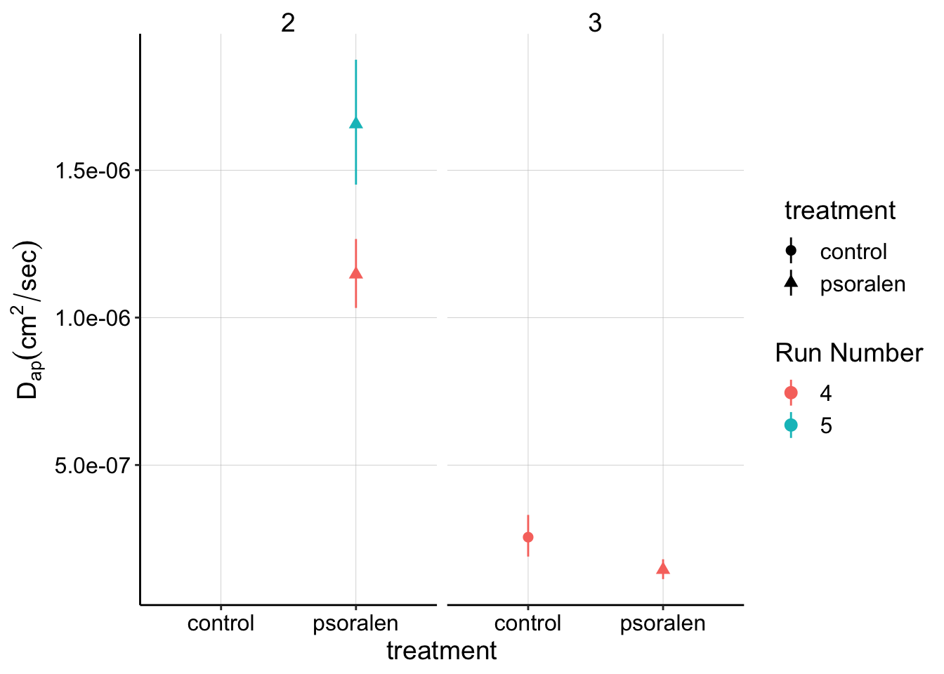
Blank vs. Biofilm
Although there may not be a clear difference +/- psoralen, let’s examine the dataset in comparison to a dataset acquired with a blank (no biofilm) IDA. This dataset should report on the \(D_{ap}\) of free PYO in solution:
ggplot(swv_gc_dap_estimates, aes(x = treatment, y = dap, color = factor(run))) +
  geom_point() +
  geom_pointrange(aes(ymin = dap_low, ymax = dap_high))+
  facet_grid(~exp_id,scales='free_x') +
  scale_color_viridis(discrete = T)+
labs(y=expression(D[ap] (cm^2 / sec)),color='Run Number') 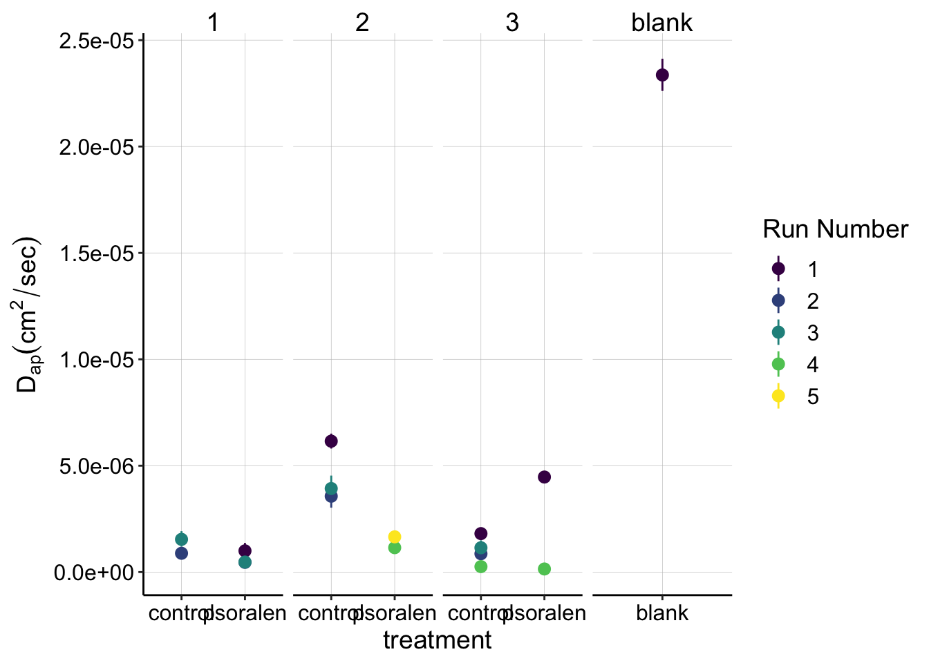
# ggplot(swv_gc_dap_estimates %>% filter(treatment!='blank' & exp_id=='3'), aes(x = treatment, y = dap, color = factor(run),shape = factor(run))) +
#   geom_point() +
#   geom_pointrange(aes(ymin = dap_low, ymax = dap_high))+
#   facet_wrap(~exp_id,scales = 'free')+
#   scale_color_viridis(discrete = T)
This plot definitely gives us a different view. It’s clear that the blank \(D_{ap}\) is much higher than the biofilm measurements, and that perspective also shows how relatively consistent our biofilm measurements are. Almost all of the biofilm measurements are between \(1\) and \(5 * 10^{-6} \text{cm}^2 / \text{sec}\), while the solution \(D_{ap}\) is nearly an order of magnitude higher.
Conclusions
- It is not clear that psoralen treatment reduces \(D_{ap}\) estimates from the IDA biofilms. Subtle differences may exist, but that will require a level of biofilm and measurement consistency that I have not yet seen.
- Broadly the control datasets do provide a reasonably confident estimate of \(D_{ap}\) for PYO in the dPHZ* biofilms.